


Blog Subjects
Recent Blogs
#1 Cover Mistake for Self-Publishers: Fonts For Content, Part III
.jpg) Font choice has to match the genre. For nonfiction, you can't go wrong with classic. Pull out the tux, so to speak. For fiction, something a little more organic. For fantasy, well, calligraphic fonts work. The thing is, If you don't hit the mark, your title will mislead. . .
Font choice has to match the genre. For nonfiction, you can't go wrong with classic. Pull out the tux, so to speak. For fiction, something a little more organic. For fantasy, well, calligraphic fonts work. The thing is, If you don't hit the mark, your title will mislead. . ..
.
.
1) difficult to read,
2) a rather fluffy mismatch to the staid and solemn Aristotle, and
3) doesn't reflect the academic content.
Switching from the overly coquettish Monotype Corsiva to Baskerville makes all the difference.
•
.jpg) Not that you always have to go classic. Creating organic lines of standard classic fonts can go a long way in attracting attention. The cover on the left is Joseph Spokek's final cover, book available online, sporting the classic font and steers clear of messing with two fonts.
Not that you always have to go classic. Creating organic lines of standard classic fonts can go a long way in attracting attention. The cover on the left is Joseph Spokek's final cover, book available online, sporting the classic font and steers clear of messing with two fonts.
But consider the cover to the right. Chapavi, a designer for 99 Designs, also uses a classic, tried and true, font. He also sticks to just the one. But he creates an organic subtitle that I, in humble opinion, find far more catchy.
If I was in charge? I'd borrow the red from the first and apply it to the second. Then pat myself on the back and consider it well done. Just saying.
FICTION: Literary novels and memoirs call for organic title fonts and artistic imagery. With the exception of romance, novels are deliberately vague by design, though they must still suggest what the story is. A fine line to walk. You have to lure in potential shoppers but can't give away the store. Novels usually do not showcase the main characters. The reason being, you don't want to get in the way of someone else's imagination, biases, and/or prejudices. Let's trot out my Sweetbriar covers to illustrate how this works: the publisher's original, the publisher's do-over, and my remake for whenever I get around to publishing my updated and illustrated editions of the Sweetbriar books.
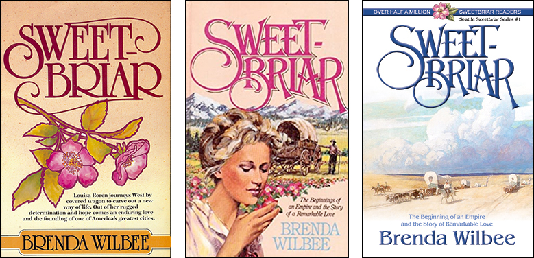
In these Sweetbriar covers, the first doesn't work at all. While we have the standard two fonts, the image collides with the title—and the image doesn't suggest what sort of story Sweetbriar is. The second is a major improvement, and because the publisher marketed Sweetbriar as a historical romance, we have the main characters depicted. However, my Sweetbriar "romances" are really biographical novels of Seattle WA's earliest pioneers. I prefer an emphasis on the history. Therefore, I opted for the vague image that nonetheless tells the reader what the Sweetbriar story is.
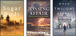
Consider these fiction covers by three friends of mine. Vague but suggestive. Sarah's book is an example of "the rules are made to be fudged." She has the two fonts, but are only manipulated by kerning--spacing between the letters. And the character depicted is unidentifiable, thereby retaining the suggestive rather than the clarified, telling the reader this is not a romance.
 to purchase Sugar Birds
to purchase Jóssing Affair
to purchase When Twilight Breaks
.
.
.
FANTASY: Fantasy fonts involve swirls; if not swirls, then one or two letters manipulated to add an organic element.
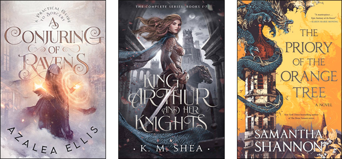 The first cover, designed by BookFlyDesign, uses swirls, varied letter sizes, and the two-font standard: Title and author.
The second cover has integrated font and image, sword piercing the text. Designed by TrifBookDesign.
The third cover's title offsets the image and so needs an unadorned font to avoid clutter. No swirls like the other two, but there is the manipulation of the "R" in all three words of The Priory of the Orange Tree. The font itself may have the extended foot on the "R" built in, but if fonts don't have this handy variation, a graphic designer can easily do this for you.
So here are two questions to ask yourself when designing your own cover but working with a designer to generate your title and subtitle.
1) Is the title bold, readable, and reflective of the content?
2) Do the fonts match the genre?
>