Cover and Typsetting
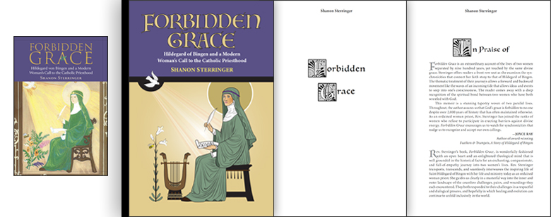
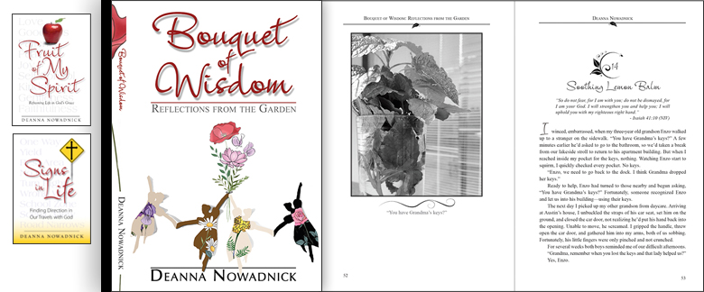
FONTS, LEADING, KERNING, GRAPHICS—all create a feel to your book. Is it How To? Inspirational? Informative? A novel? What kind of novel? There is a way to manipulate the text to carry the "aroma" of the narrative. To do this, I have been known to create my own decorative fonts and doodles. Do you have photos? The challenge is to generate a clear image from unprofessional photographs that too often scream "self published!" But it is sometimes doable (Bouquet of Wisdom, Forbidden Grace). I have chosen at times to sketch the essence of a photo, which serves to eliminate the clutter (Skagway: It's All About the Gold Rush). It's always up to you.
 FORBIDDEN GRACE: PageMill Press asked that I generate a cover similar to Shannon's submitted artwork, which I did using Illustrator. For the interior design and typesetting—and because Shannon alternates chapters between St. Hildegard and herself—I created my own ornamental font to blend medieval with contemporary, lending an aura of timelessness.
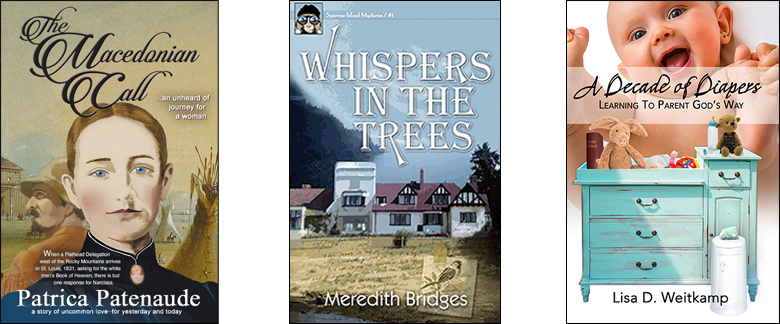
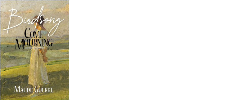
RANDOM COVERS: The novels and memoir involve Photoshop and public domain art to create a sense of distant time. Lisa's book is all Photoshop.


•

•
BOUQUET OF WISDOM: My challenge with Bouquet of Wisdom was to match Deanna's previous book covers—yet strike a course more reflective of this book's content. Another challenge: Find a way to suggest Deanna's light-hearted style. To that end, I relied on Illustrator and reworked purchased clipart to maintain her garden theme. My bigger challenge was the photography. Cell phones and old cameras rarely have enough data to print well and can involve a lot of manipulation that may or may not turn out well. But we gave it our best shot.

•
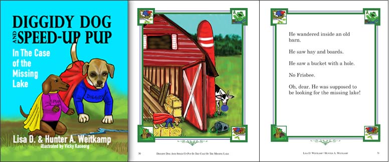
DIGGEDY DOG: Lisa submitted her own art files for the cover and interior pages. Not all the art was of the same size and I had to digitally "paint" extensions to generate consistency. Being a children's book, I created the border for eye appeal and then used it to frame both illustration and narrative.
•

SERMONS TO CHANGE LIVES: New Sound Publishing wanted a new bold and simple look.

•
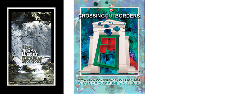
NOISY WATER REVIEW and TYCA: Notice Noisy Water Review: I positioned an ant on a rock in the lower right hand corner to give this literary magazine a bit of funk. The TYCA catalog combines Photoshop and Illustrator to merge the concepts of creativity within and around infrastructure.

•
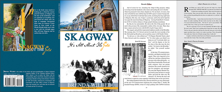
SKAGWAY: I self-published my 10th book due to its regional appeal. To get a sense of Skagway's "now and then," I contrast two photos—1898 and 2013. In the interior, I make full use of sidebars, pull quotes, old gold rush photos, and my own sketches when the photography is too busy or of such poor quality I can't salvage it.

•
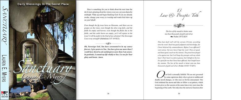
SANCTUARY: I went surreal on this one. New Sound Publishing hated this "on spec" cover but the author loved it. She'd had a vision, and I somehow produced it. Don't ask me to explain. A lot of photoshopping here, using multiple images. The interior clipart and font choice creates a sense of ancient wisdom.

•
HEALING SHAME AND GUILT: Sometimes I am asked to replicate a cover.


•

CHASING PAPER: Likewise, I'm sometimes asked to resize a cover or am given new back copy. Both require new digital files.

•
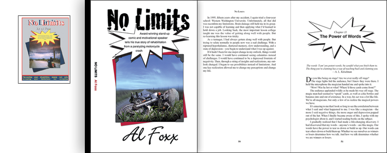
NO LIMITS: DDA Publishing gave me an author's homemade cover and edited manuscript and asked I do what I could while maintaining Al's comic book dialog bubble.

•
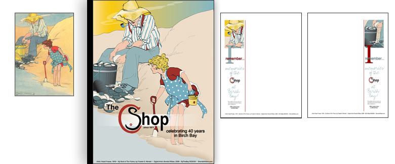
THE C SHOP: The C Shop wanted an autograph book to celebrate 40 years at Birch Bay, WA. For the cover, I used Hazel Frazee's public domain art, replicated it in Illustrator, and then used bits of the main for the interior.

•
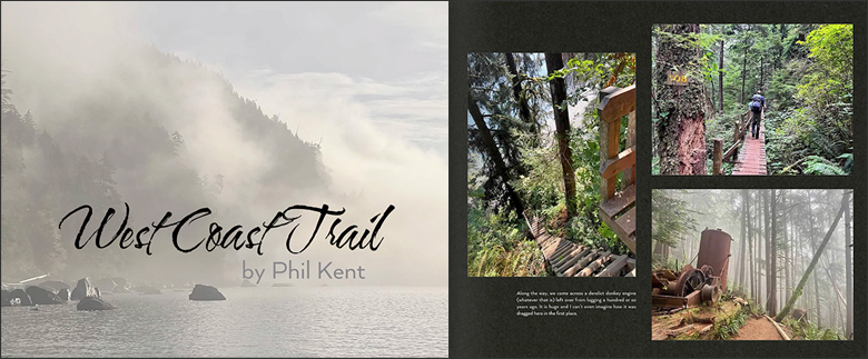
ADVENTURE & MEMORY BOOKS: I love putting people's adventures and memories into Shutterfly. I use Photoshop to enhance submitted photos and place the narrative, editing if need be.
Hope this gives you a good idea of how I
can help you with your cover and interior layout!

•
Hope this gives you a good idea of how I
can help you with your cover and interior layout!
.
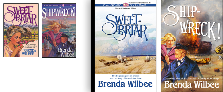
It might be interesting to know how I, a writer, got interested in cover design. Before I could print, I drew. There was that. Then there's this: I loathe the covers on nine of my ten covers. I was teaching English Composition at Whatcom Community College when I discovered the college's Visual Arts and Communications Department, and I began taking classes between grading essays. My early portfolio includes redesigns of all my covers. I offer two below. I replicated the font (Algerian) to maintain reader recognition but then dispensed with what I felt was inadequate imagery for the content. In Sweetbriar, I opted for Andrew Wyeth's famous painting to establish that Louisa's story is very much a real story. For Shipwreck! I repositioned Emily and her husband so that her hair was not on fire and smoking, and then used bits and pieces of public domain paintings to highlight the fire, the long boat, and handful of crew—all of which are important in this biographical novel. The design bug bit and I switched to design, writing on the side, and haven't looked back.
It might be interesting to know how I, a writer, got interested in cover design. Before I could print, I drew. There was that. Then there's this: I loathe the covers on nine of my ten covers. I was teaching English Composition at Whatcom Community College when I discovered the college's Visual Arts and Communications Department, and I began taking classes between grading essays. My early portfolio includes redesigns of all my covers. I offer two below. I replicated the font (Algerian) to maintain reader recognition but then dispensed with what I felt was inadequate imagery for the content. In Sweetbriar, I opted for Andrew Wyeth's famous painting to establish that Louisa's story is very much a real story. For Shipwreck! I repositioned Emily and her husband so that her hair was not on fire and smoking, and then used bits and pieces of public domain paintings to highlight the fire, the long boat, and handful of crew—all of which are important in this biographical novel. The design bug bit and I switched to design, writing on the side, and haven't looked back.

If you want to talk with me about typesetting and designing your book or booklet,
I'd love to hear from you.
Brenda@BrendaWilbee.com

I'd love to hear from you.
Brenda@BrendaWilbee.com
