Photo Enhancement, Sketching, Spin Off Marketing Products
.jpg)

An alternative to photographs is selective sketching. In this first example, I didn't need all the details of the men or the building. By picking and choosing white space, I was able to provide focus on the billboard and bunting of Skagway AK's infamous gold rush mob headquarters.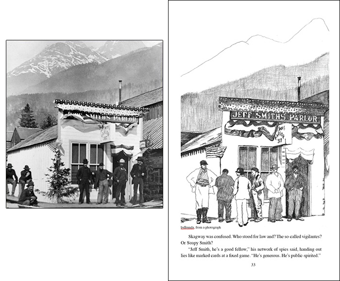
BOOKPLATES
.
.
.
.
...
.
.
.
Designed for members of my book launch team.
Everyone loves a signed book! Bookplates speak to the professional you are.


.
.
.
.
...
.
.
.
•
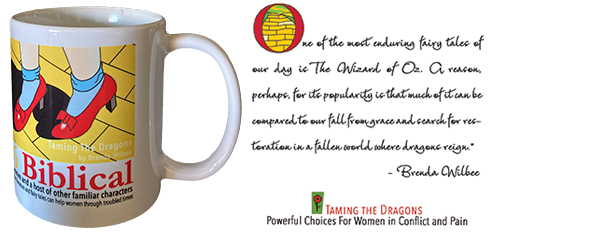
MARKETING MUGSDesigned for members of my book launch team.

•
POSTCARDS
Postcards mark you the professional you are. They can be used for thank you's, reminders, follow-up queries, and they make great giveaways at speaking engagements.
Postcards mark you the professional you are. They can be used for thank you's, reminders, follow-up queries, and they make great giveaways at speaking engagements.

•
POSTERS and FLYERS
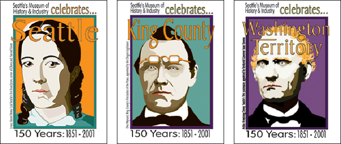
Generated in Illustrator, this kind of art can be expanded to any size, handy for speaking engagements. Unlike images that will pixelate when enlarged, this vector-shaped software creates clean, sharp images that can go small or go big. It makes no difference to the quality. It's why I favor Illustrator.
Generated in Illustrator, this kind of art can be expanded to any size, handy for speaking engagements. Unlike images that will pixelate when enlarged, this vector-shaped software creates clean, sharp images that can go small or go big. It makes no difference to the quality. It's why I favor Illustrator.
.jpg)
•
BOOKMARKS
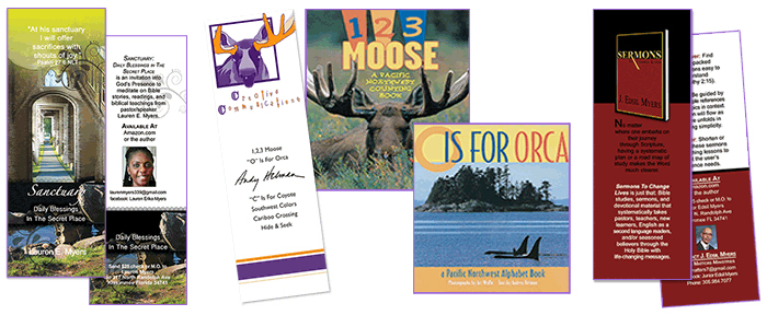
By far the easiest and most economical publicity you can have!
By far the easiest and most economical publicity you can have!

•
PHOTO ENHANCEMENT - before and after
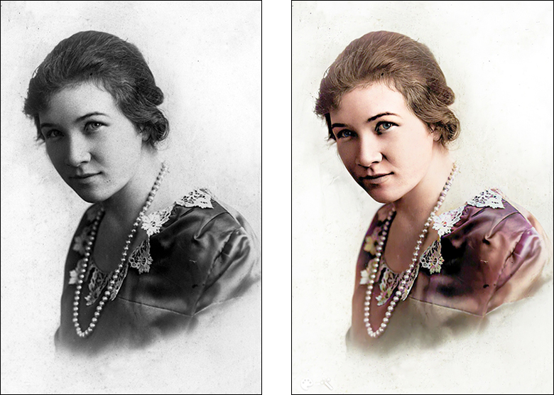
Pictures say a thousand words! But putting them in your book can be a challenge. One, unprofessional photographs don't translate well. Two, we have this pesky thing called "dot gain." Ink absorbs into the paper and designers work closely with printers to minimize this. Photographs can go very gray very fast and more often than not need some light brought into them. As in the picture below.
Pictures say a thousand words! But putting them in your book can be a challenge. One, unprofessional photographs don't translate well. Two, we have this pesky thing called "dot gain." Ink absorbs into the paper and designers work closely with printers to minimize this. Photographs can go very gray very fast and more often than not need some light brought into them. As in the picture below.

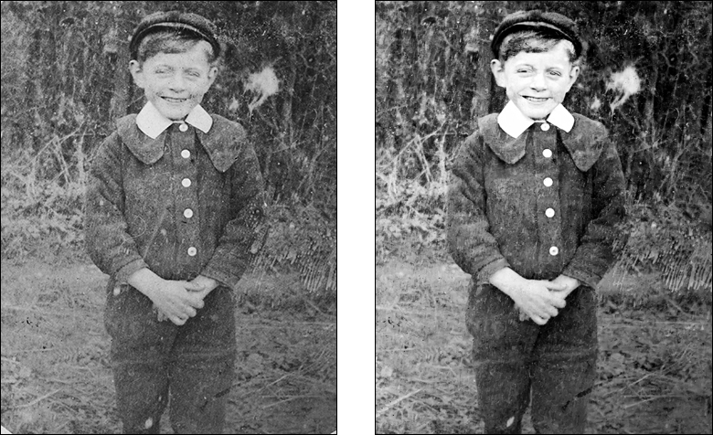
People writing their memoirs have all kinds of family photos in a shoebox. Seriously challenging. The 1908 picture below was badly scratched and, cameras being what they were, quite fuzzy. I was able to eliminate the worst of the damage and Godfrey Victor's face looks a whole lot better.

I particularly enjoy colorizing old photos! Check out Freda Eloise! A 1918 photo!

•
SKETCHESAn alternative to photographs is selective sketching. In this first example, I didn't need all the details of the men or the building. By picking and choosing white space, I was able to provide focus on the billboard and bunting of Skagway AK's infamous gold rush mob headquarters.

•
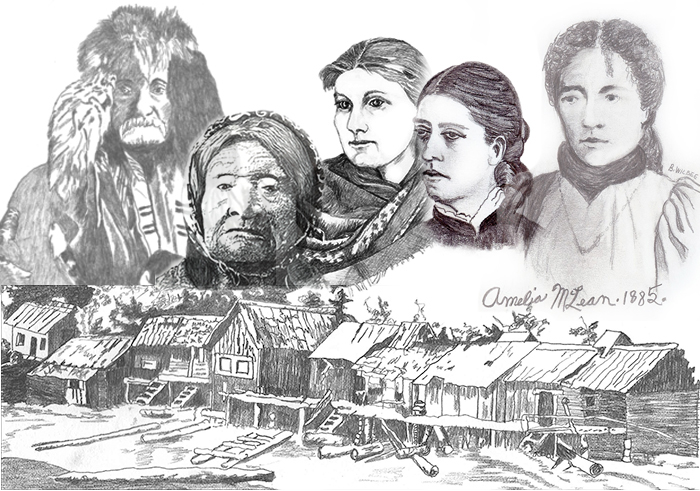
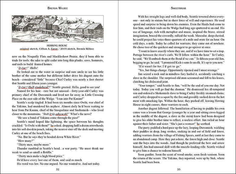
In the same vein, I sketch characters for biographical novels and—in the process of updating my own best-selling Seattle Sweetbriar Series—I stumbled across a public domain image of a Duwamish village near Seattle in 1852. The example below is a collage of character sketches and the Duwamish village. Below are pages 32 and 33 of my Sweetbriar update-in-progress. A picture is worth a thousand words. 

•
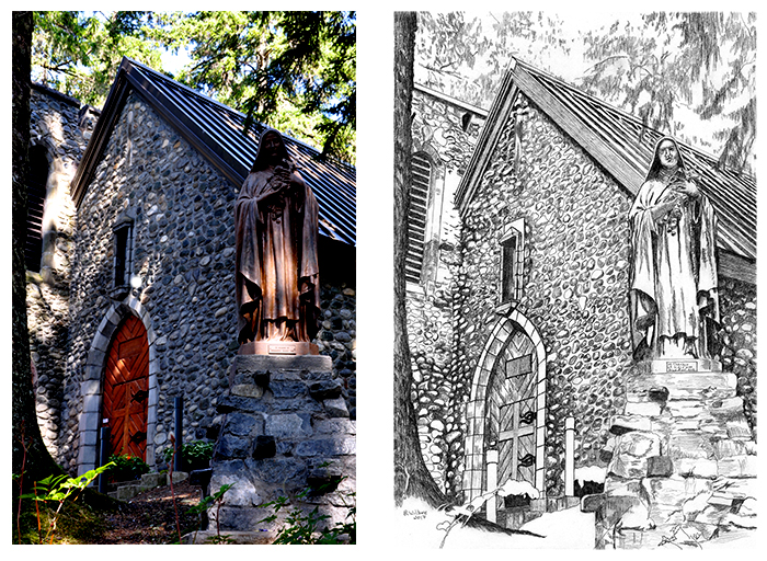
I'm sometimes asked to sketch a photograph for inclusion in a book. In this example, the request was for St. Terese of Juneau, AK.

Hope this gives you a good idea of how I can help you
with illustration—for your book and all your marketing products!
with illustration—for your book and all your marketing products!
If you want to talk with me about illustration (I use Adobe Illustrator),
I'd love to hear from you.

