#1 Cover Mistake for Self-Publishers: Font Rules, Part II
by Brenda Wilbee, in Self-Publishing

1st RULE OF THUMB
When it comes to book cover fonts is no more than two. Why? It’s too much. It’s like reading amphetamines. All hopped up and chaotic and leaves you feeling a bit dizzy. You can sometimes get away with an italic of one font. But tread carefully.
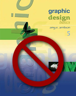
Here’s a cover with four fonts. Graphic Design Basics by Amy E. Arnston is super cool for this artsy genre, but for the rest of us? Our fiction and memoirs? Not so much.
In descending order, I'm guessing Denise Davidson, graphic designer for this Thomson Wadsworth book, 2007, used arial, arno pro, times italic, and papyrus. The artsy-fartsy works in this small niche genre. For the rest of of us, we flirt with the self-published look.
.
2nd RULE OF THUMB:
One font is king. If you go for two, like I do, use one serif, one sans serif. It's a good way to sort title from author. Random House did this with Tara Westover's Educated. Mark Dorfman, graphic designer for Simon & Schuster, however, went with one for Stephen Markley's The Deluge.

3rd RULE OF THUMB:
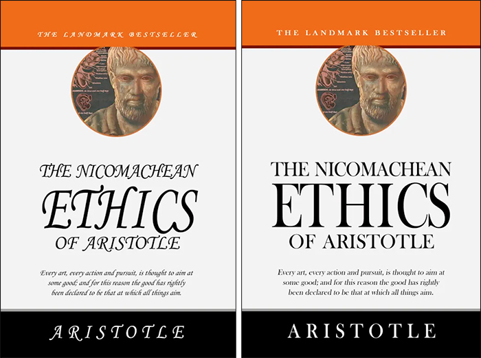
The fonts have to reflect the content of the book. Coverdesignstudio.com is a great website for do-it-yourself covers. To illustrate how critical this is, they take the same cover with different fonts. One is a bit tacky, suggestive one self-design. The other is authoritative and professional.
As coverdesignstudio.com points out, Monotype Corsiva gives the first cover a "fluffy" look whereas the Baskerville of the second eliminates the fluff and pops the title. I am not going to look twice at the first, I will pick up the second. You?

THE THREE THUMBS:
1) No more than two fonts.
2) If you use two, use one serif, one sans serif
3) Font must reflect content of book.
Of course there's lots of other stuff to consider and you can put off writing your story forever by going down Google's rabbit holes. Or you can query me. Send an email with your phone number. I offer a half-hour free chat about what you'd like to do. If you love the bunny trails as much as I do, best of luck and let me know what you create for yourself!
Brenda@BrendaWilbee.com


