

Blog Subjects
Recent Blogs
#1 Cover Mistake for Self-Publishers: Fonts That Yawn—Part I
by Brenda Wilbee, in Self-Publishing
Self-publishing has its advantages but let's face it—the hurdle to overcome is the inevitable assumption you don't have what it takes to go traditional. This may or may not be true, but one thing you don't want to do is look like the amateur everyone assumes you are. First the bad news. You do this to yourself. You go cheap on a cover. The good news? There are ways to cut costs. . .
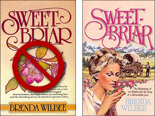
The first thing a reader sees is your cover, and one thing I know is that you cannot do worse than the first try of my publisher in 1983 with Sweetbriar. Let's go ahead and say this: This cover is unprofessional. Two issues make it so: 1) The font doesn't work with the image and 2) The image doesn't reflect the book contents. Actually, my reaction has always been gag me with a spoon, it's that bad.
I'm not sure I like the redo. But it does address the two issues. The font is manipulated to work with the image. The image actually relays the content. Another day we'll address cover images. Today, we'll stick to font manipulation.
You have one second to attract attention on a bookshelf. Font choice and presentation buy you another second. That extra second is critical, yet I see a lot of do-it-yourself covers with standardized fonts and the inevitable boring conformity. Yawn. Each letter is the same size, the ascenders and descenders are the same, spacing is the same. Unless you have software that allows for text manipulation and access to a variety of fonts—you're sort of stuck. You're trapped into that self-published "look." No matter your content, readers will steer clear.
If you don't have the know-how or necessary software, your simple fix is to hire someone to work with just the text. Create your own cover, sure (not recommended, more on that another time), but do give your file to graphic designer who can upgrade banal to innovative. Sure, it might set you back a week of lattes, but it's not a shabby price to pay, considering. And it is tax deductible; your coffee is not. Already a win-win. Let me show you the what and wow.
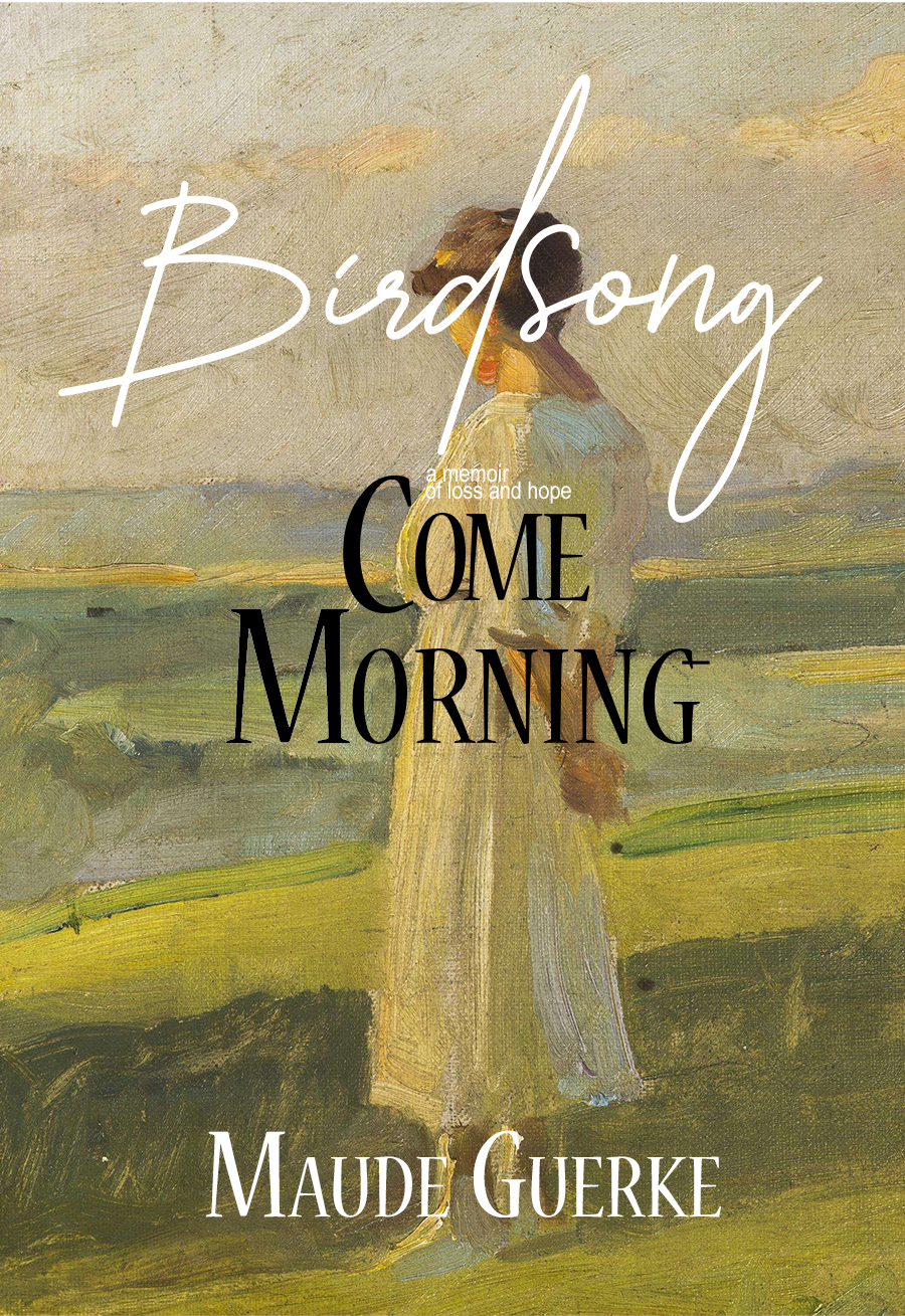
 Birdsong Come Morning—Standard
We're looking at the left image.
1) Background image: "Lady in White" by Franz Dvorak, 1927. Wikimedia is an excellent resource for finding pubic domain images that cost you nothing. If you're Dutch or Scotch like me, this a jump-up-and-down bargain.
2) Birdsong is a font called Callifornia. I like it because the letters are varied. If you like it, here's the link to download your own. free font In the first image
3) General rule of thumb: Two fonts only, preferably a mix of serif and sans serif. The goal is simplicity. Two serifs can clutter. The KISS method for writing is true for covers. Keep It Simple, Stan. Limiting fonts helps. I did, however, bend the rule a tad by using Arial for "a memoir of loss and hope." In this case, doing so simplify rather than clutter.
4) Come Morning is Neuve STD. I chose it because it serves as a solid, well-grounded font compared to the more air, floating quality of Birdsong.
5) Same Neuve STD for the author's name—either that or Callifornia. I opted for Neuve to keep the visual line, top to bottom, seamless. It's an okay cover, but see what giving up seven cups of coffee will do for you. . .
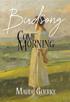
Birdsong Come Morning—Manipulated
We're looking at the right image.
1) I messed with the "d" and "g" of Birdsong by going into Illustrator, turning the fonts into outlines, then deleted vector points on the "d" tail to cut the descender shorter, allowing me a snugger fit with the rest of the text. I also messed with the "g," turning it's tail inward. This creates a singular "image" of text, a less-than-a-second read. I added a slight drop shadow to Birdsong" to create a 3-D effect and give the reader a place to start reading. Had I not done that, Come Morning would hog the attention.
2) I re-arranged the text Come Morning to make it more appealing, to avoid banality. To tie the two words close together, an anchor to the Birdson.
NOTE: It's not recommended to use drop shadows, a popular error for self-publishers. One, it's a bit gimmicky and needs to serve a purpose; two, most books are sold online and need to be readable in a one-inch thumb. Shadows can really muck this up.
.
.
To conclude, there are some inexpensive ways to create you own cover, but I suggest you not fudge on well-crafted fonts. Give the sceptic a reason to take another look. A few sales is money in the bank and you're on your way.
If you'd like to query me about what I can do for you, just email with your phone number. I offer a free half-hour to discuss what you'd like to do.
I'm not sure I like the redo. But it does address the two issues. The font is manipulated to work with the image. The image actually relays the content. Another day we'll address cover images. Today, we'll stick to font manipulation.
You have one second to attract attention on a bookshelf. Font choice and presentation buy you another second. That extra second is critical, yet I see a lot of do-it-yourself covers with standardized fonts and the inevitable boring conformity. Yawn. Each letter is the same size, the ascenders and descenders are the same, spacing is the same. Unless you have software that allows for text manipulation and access to a variety of fonts—you're sort of stuck. You're trapped into that self-published "look." No matter your content, readers will steer clear.
If you don't have the know-how or necessary software, your simple fix is to hire someone to work with just the text. Create your own cover, sure (not recommended, more on that another time), but do give your file to graphic designer who can upgrade banal to innovative. Sure, it might set you back a week of lattes, but it's not a shabby price to pay, considering. And it is tax deductible; your coffee is not. Already a win-win. Let me show you the what and wow.
Birdsong Come Morning—StandardWe're looking at the left image.
1) Background image: "Lady in White" by Franz Dvorak, 1927. Wikimedia is an excellent resource for finding pubic domain images that cost you nothing. If you're Dutch or Scotch like me, this a jump-up-and-down bargain.
2) Birdsong is a font called Callifornia. I like it because the letters are varied. If you like it, here's the link to download your own. free font In the first image
3) General rule of thumb: Two fonts only, preferably a mix of serif and sans serif. The goal is simplicity. Two serifs can clutter. The KISS method for writing is true for covers. Keep It Simple, Stan. Limiting fonts helps. I did, however, bend the rule a tad by using Arial for "a memoir of loss and hope." In this case, doing so simplify rather than clutter.
4) Come Morning is Neuve STD. I chose it because it serves as a solid, well-grounded font compared to the more air, floating quality of Birdsong.
5) Same Neuve STD for the author's name—either that or Callifornia. I opted for Neuve to keep the visual line, top to bottom, seamless. It's an okay cover, but see what giving up seven cups of coffee will do for you. . .
Birdsong Come Morning—Manipulated
We're looking at the right image.
1) I messed with the "d" and "g" of Birdsong by going into Illustrator, turning the fonts into outlines, then deleted vector points on the "d" tail to cut the descender shorter, allowing me a snugger fit with the rest of the text. I also messed with the "g," turning it's tail inward. This creates a singular "image" of text, a less-than-a-second read. I added a slight drop shadow to Birdsong" to create a 3-D effect and give the reader a place to start reading. Had I not done that, Come Morning would hog the attention.
2) I re-arranged the text Come Morning to make it more appealing, to avoid banality. To tie the two words close together, an anchor to the Birdson.
NOTE: It's not recommended to use drop shadows, a popular error for self-publishers. One, it's a bit gimmicky and needs to serve a purpose; two, most books are sold online and need to be readable in a one-inch thumb. Shadows can really muck this up.
.
.
To conclude, there are some inexpensive ways to create you own cover, but I suggest you not fudge on well-crafted fonts. Give the sceptic a reason to take another look. A few sales is money in the bank and you're on your way.
If you'd like to query me about what I can do for you, just email with your phone number. I offer a free half-hour to discuss what you'd like to do.
We're all in this together.